Link to my LinkedIN.
https://www.linkedin.com/in/sophie-neerup-larsen-45b01990/
Hire Me
My name is Sophie, and I am a Ui & UX designer from Copenhagen Denmark, I am looking for new exciting challenges!
sophienlarsen@yahoo.dk
Case project focused on loyalty and ordering experience

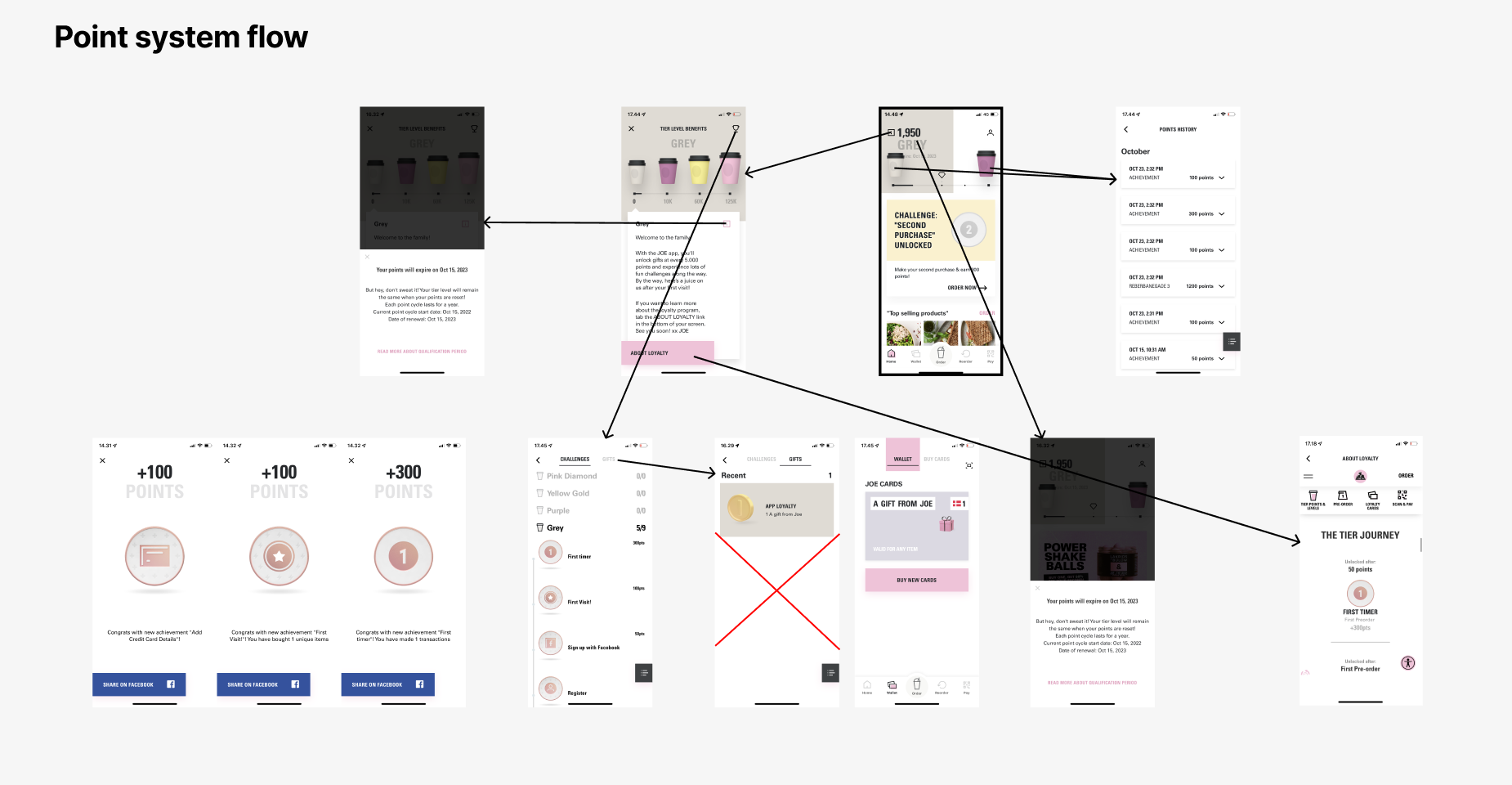
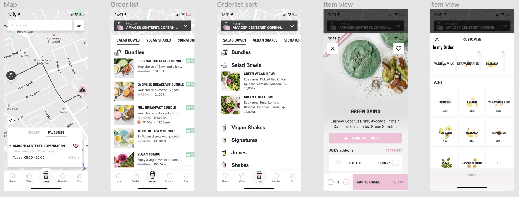
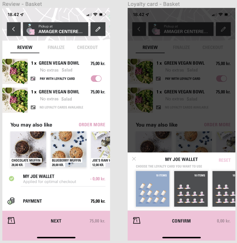
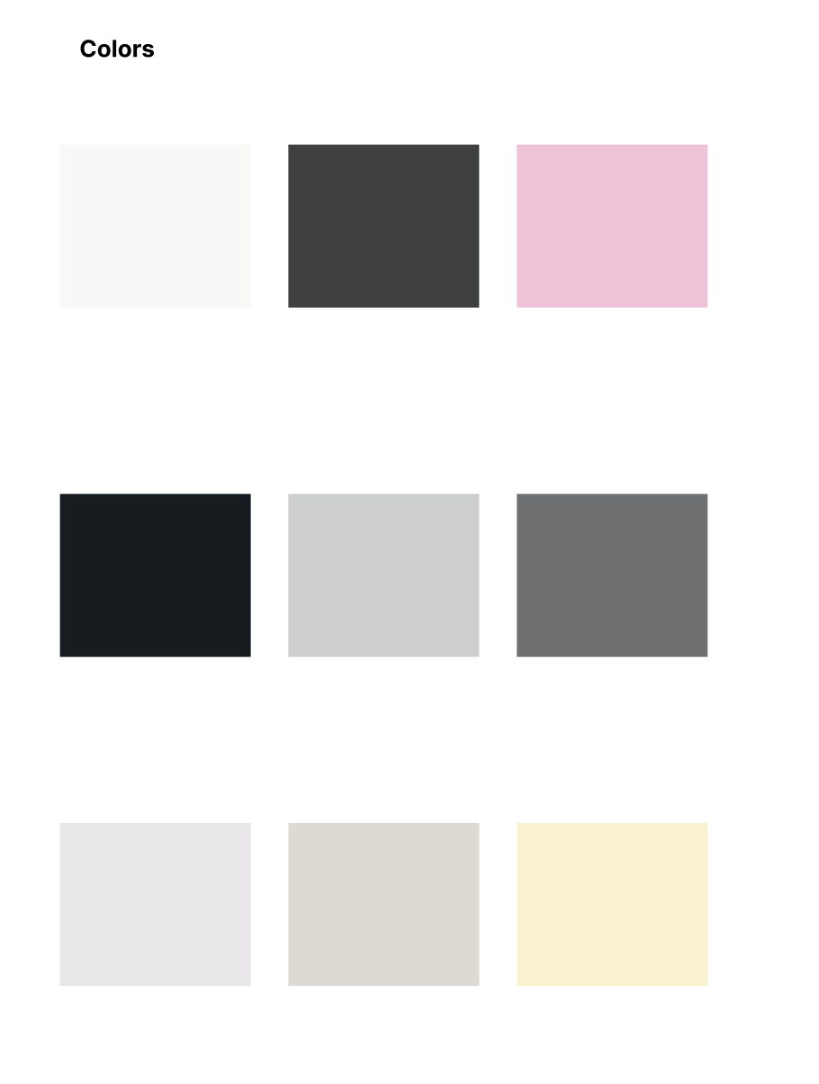
Improving flow and clarity while staying true to an established brand
This was a conceptual case project where I chose to explore and improve the user experience of Joe & The Juice’s mobile app. The purpose was to identify areas of friction from a user perspective and redesign key features to provide a cleaner, more intuitive experience, all while maintaining brand alignment.
The project focused specifically on the loyalty program, loyalty cards, and order navigation flow, which I identified as complex and slightly disconnected from user expectations.
While Joe & The Juice has a strong brand and sleek visuals, the app presented friction in several core areas of the user journey — especially around loyalty and ordering. My goal was to rethink these experiences without compromising their tone, energy or branding.
I initiated the process by doing a “go-along” study with a first-time user. Observing their experience in real time gave me insights into:
I supplemented this with desk research and heuristic evaluation to prioritize focus areas.
Key issues discovered:
Primary persona:
I created a journey map of a first-time loyalty user to identify drop-off points.
My final redesign included:
Strong branding should support — not overshadow — the user experience.
This project highlighted the balance between respecting a brand's strong identity while improving usability. I learned how subtle UX changes — like better micro-interactions or clearer structure — can have a large impact without changing the overall look and feel. If further developed, I would recommend testing the proposed flows with real users and exploring deeper integration between loyalty and in-store experience.